
Below is a case study of a project I worked on as the Creative Director overseeing every element of design and branding to produce a coherent brand experience throughout the entire company.

SWANBOROUGH LAKES
LUXURY HOLIDAY LODGES
Creative Director
Swanborough lakes consists of 12 luxury holiday lodges situated in the South Downs National Park.
I have overseen every element of the brand design and operation
right through from initial concept to build and live customer experience.
1
BRANDING CONCEPT
Swanborough Lakes is a high end, luxury holiday park aimed primarily at couples. Every aspect of the project needed to reflect the high end nature of the brand. The park must be seen as 'aspirational' and 'instagramable'.
Through market research we could see that our break out age group was in fact the 18 - 30's. No longer looking for cheap and cheerful holidays the desirable for this age range is now a holiday that you can show off and post on social media, a holiday that feels 'exclusive'.
We needed to create the ultimate, modern and romatic getaway.
Some of the items that I drew up as initially essential to create this feel were:
Privacy, top quality products / electric goods, surround sound, super king size beds, luxury bedlinen, branded bathrobes and of course most importantly -
hot tubs!


2
LOGO DESIGN
The Swanborough Lakes logo needed to embody luxury life style, simplicity and romance. The swan's created the perfect reflection on the location name and using two of them invokes the idea of a couples holiday. The necks also form a heart shape to help illustrate this further. I used simple clean lines to help create the feel of modern aspirational living.


The brand colour needed to be both modern and aspirational. I took a colour palate across a range of dark greys into deep blues and ended up choosing a deep slate blue.
This keeps the brand modern whilst still retaining a softness and personality


Click on the arrows to look through the gallery.
Click on the images to read more about each one.
3
INTERIOR / EXTERIOR
Brief - Luxurious, modern and as timeless as possible.
The design concept for the interior and exterior started with 'Scandinavian'. I wanted the exterior to look instantly high end yet simple using wood, steel and glass. The lodges are clad in larch which was chosen due to the fact that it changes colour as it oxygenates over time. This has enabled the lodges to blend into the landscape as per our planning brief.
For the Interiors I decided to go for two main different colour ways (dark and light) and then add individual personality and colour to each Lodge. The guests have loved this and always request their favourite lodge when returning. I added elements of luxury with the fabrics and products that I chose and elaborated even more on this idea for the one bed lodges as the ultimate romantic choice.

4
WEB DESIGN
The web design for Swanborough Lakes needed to be Sleek, Functional and Easy to Use. The customer journey was key as I needed to entice in the customer whist quickly moving them through the site to the booking pages. There was also a large amount of infomation that I needed to include such as local info, lodge layout and extra options to name a few.
I used high quality photos and kept the site as simple as possible using only brand colours and fonts.

5
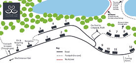
SIGNAGE
Signage is key in communicating a brand and creating an immersive experience.
I wanted to keep the signage as low key as possible so that it felt as if it was blending into the background. I chose only the most essential signs and everything is fully branded from the individual lodge door decals to the 5 mile an hour signs and even the toilet sign in reception. Absolutely everything on site is using brand the brand colours, logo and fonts.


Click on the arrows to look through the gallery.
Click on the images to read more about each one.


6
STATIONERY
Swanborough Lakes needed a broad range of stationary from business card and leaflets to welcome cards and maps. Every sign in and feed back form are also branded to ensure full brand immersion for our guests.


I work with several great photographers over my time as Swanborough Lakes to ensure we kept everything we produced whether digital or print to the high end 'aspirational' level the park needed to ensure guest bought into the idea of the luxury brand.


Click on the arrows to look through the gallery.
Click on the images to read more about each one.
7
WELCOME BOOK
When the guests arrive at the site they all receive a bespoke check in service. I designed this system to make the guests feel extra special. This includes courtesy calls from the park manager prior to arrival, the arrangement of any option extras, a smooth and quick check in on site, a luxury welcome pack apon arrival and also the luxury welcome book.
The welcome book if full colour and most of the pages are fully photographic. The book is finished with a luxurious matt branded cover again communicating to the guests that nothing on their holiday will be less than high end aspirational living. The welcome book is full of local information and FAQ's. It is a luxury update from the holiday parks of the past where you received a plastic folder full of old leaflets!

8
EXPERIENCE
The customer experience at Swanborough Lakes is paramount. As creative director I designed every aspect of the park to seamlessly flow with the brand. I never wanted it to be too in the guests faces but yet every single item on site has been designed and chosen with the guests experience of the brand at heart. It was clear to see that the more we raised the bar of the concept of luxury the more the guests both enjoyed it and bought into it. Even the staff tell me how much they love it as it is a clear living concept with high standards that they enjoy being part of and upholding.
This is the true power of immersive branding.